
Full Article: 5 Min Read Time
Quick Check:
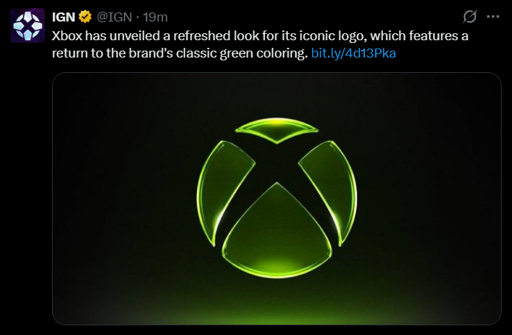
Xbox has unveiled a new green logo in April 2026, marking a departure from the minimalist black-and-white design that had been in use since 2019. The refreshed Xbox logo retains the iconic "X" sphere silhouette but brings back the brand's signature green color in a deeper, glossy, glass-effect finish, evoking the glow and dimensionality of the original Xbox era. The reveal coincided with a sweeping internal rebrand announced by Xbox CEO Asha Sharma on April 23, 2026, under the rallying declaration: "We Are Xbox."
Microsoft's Xbox division has officially pulled back the curtain on a redesigned logo that brings the green color scheme back. This was shared on Xbox's official social media channels on April 24, 2026 and the new visual identity shows a glowing green "X" sphere, which is rendered with a slick, three-dimensional glassy sheen, set against a stark black background.
It formed the centerpiece of a far larger strategic shift orchestrated by Xbox CEO Asha Sharma, who only took the helm of Microsoft's gaming division roughly two months ago after Phil Spencer's departure. In an internal memo co-authored with Xbox President Matt Booty and published on the Xbox Wire blog, Sharma addressed the global Xbox team with a frank admission: "Players are frustrated. New feature drops on console have been less frequent. Our presence on PC isn't strong enough. Pricing is getting harder for people to keep up with."
The memo, titled "We Are Xbox," declared the end of the "Microsoft Gaming" division name, which was a label that had been adopted in 2022 during the company's pursuit of the Activision Blizzard acquisition, and a formal return to the identity that millions of gamers worldwide had grown up with.
Now, before you ask, the Xbox logo design 2026 is not the "Project Helix" symbol that had been circulating in industry leaks. Instead, it's a refreshed take on the classic sphere logo with a glossier, more luminous finish and a deeper, richer shade of green compared to earlier iterations.
Industry insiders and fans on social media were quick to react. The official "Mountain Dew and Razer" accounts replied, "We are so back." Fan posts celebrated the design as a signal that Xbox was reclaiming its core identity after years of what many felt was brand confusion under the broader Microsoft Gaming umbrella.
"Microsoft Gaming describes our structure — but it does not describe our ambition. So, we are going back to where we started."
— Asha Sharma, Xbox CEO & Matt Booty, Xbox President — Xbox Wire, April 23, 2026
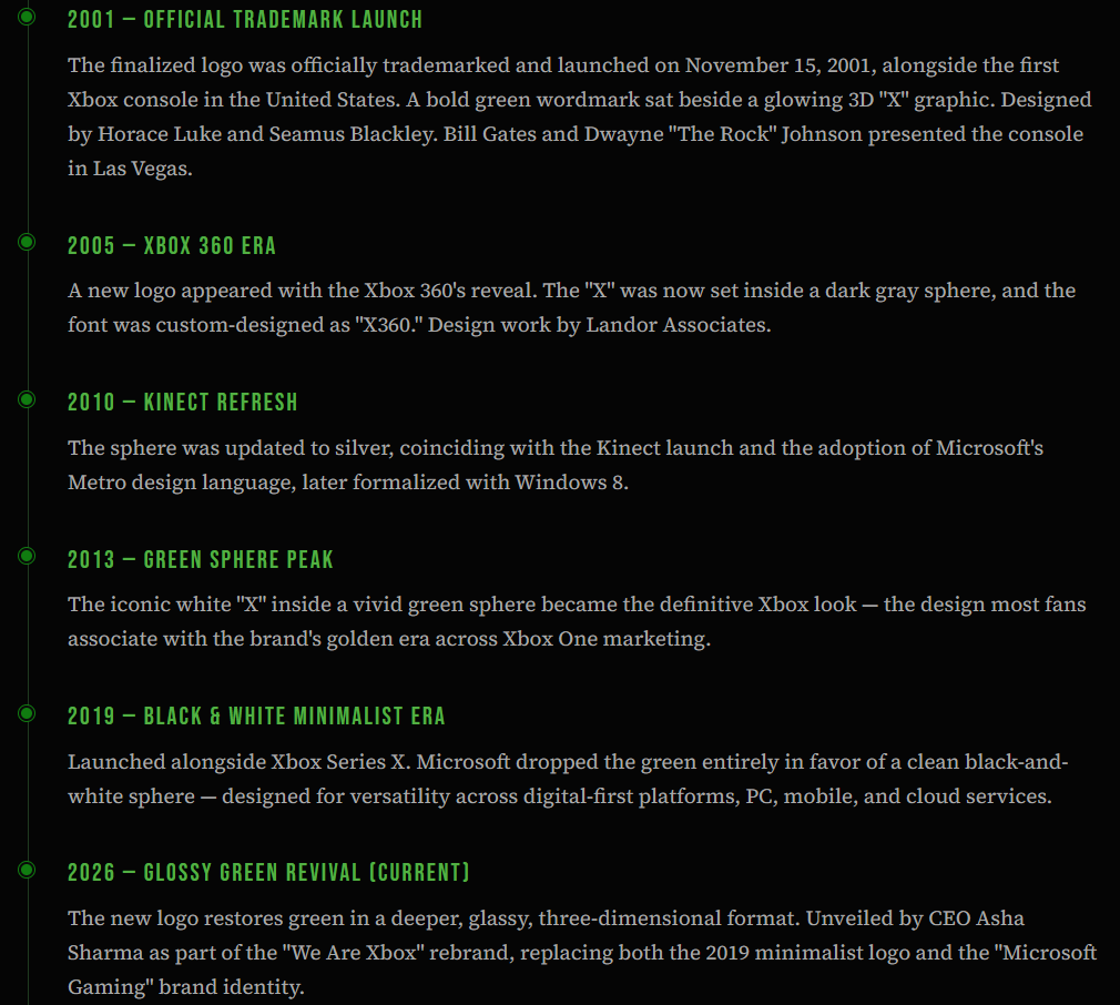
The Complete Xbox Logo Timeline:
Trademark Status & How Long This Logo Will Last:
The Xbox logo and all associated visual trademarks are registered globally by Microsoft Corporation across multiple classes — covering hardware, software, online services, and entertainment products. Microsoft actively enforces these trademarks worldwide, and unauthorized commercial use of the Xbox logo faces legal action.
The current custom typeface used in Xbox branding is "Xbold," a proprietary geometric sans-serif developed specifically for the brand. As for longevity, the 2019 black-and-white logo lasted approximately seven years before this 2026 change. Historically, major Xbox logo overhauls have aligned with new console generations, typically every 5 to 8 years. Given that the next-gen Xbox console "Project Helix" is reportedly in development and may launch in 2027 or beyond, this green logo could serve as both a transitional identity and a long-term brand anchor.
Questions for You:
- What are your thoughts on this new Xbox logo?
- What's your favorite version of the Xbox logo from the last 20 years?
- Which look do you prefer: the minimalist black-and-white or this classic neon green?
Let me know in the comments, where you can also provide the latest news so I can make a breakdown of it.